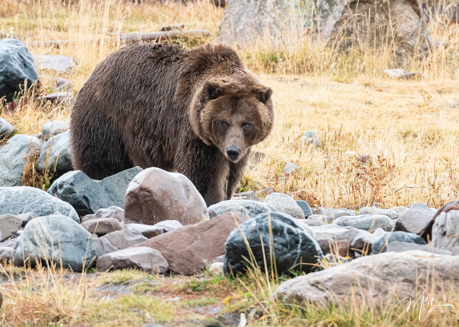
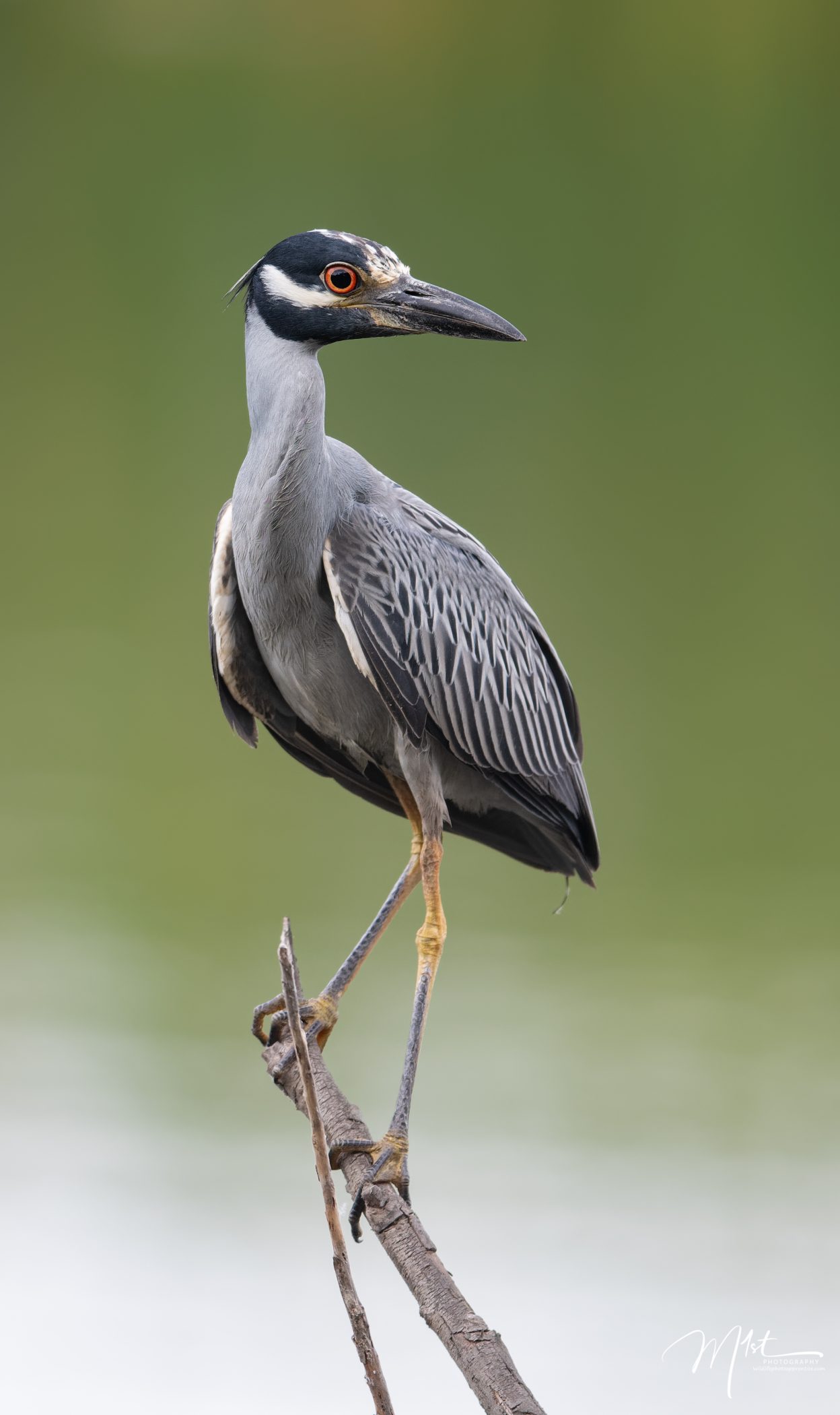
Wildlife photography is a captivating and challenging genre that requires a deep understanding of the interplay between light, color, and the histogram. As wildlife photographers, we strive to capture the beauty and essence of the natural world. In this blog post, we will explore the relationship between light, color, and the histogram, and how this understanding can enhance our ability to create stunning wildlife photographs.
Light
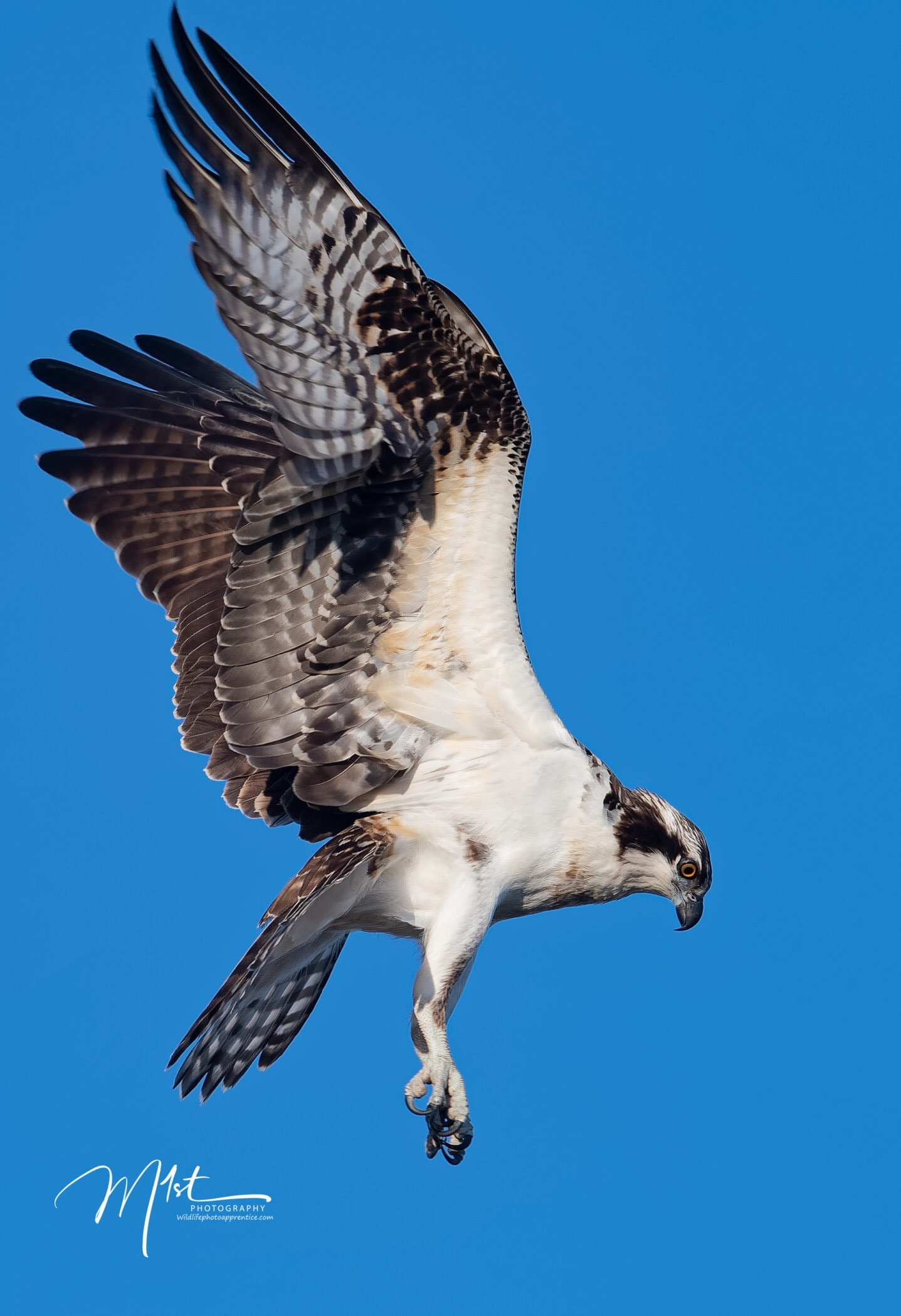
Light is the lifeblood of photography, and in wildlife photography, it plays a crucial role in capturing the awe-inspiring moments in nature. Understanding the qualities of light, such as direction, intensity, and color temperature, helps photographers make informed decisions about exposure settings and composition. By harnessing the power of light, we can create images that evoke emotion and showcase the remarkable beauty of wildlife.
Light is a form of electromagnetic radiation that is visible to the human eye. It is a fundamental part of our everyday experience, allowing us to perceive the world around us and providing us with information about our environment. Light is composed of tiny packets of energy called photons, which are massless particles that travel in waves. These waves have both electric and magnetic components, hence the term “electromagnetic radiation.” The behavior of light can be described by its properties, such as wavelength, frequency, speed, and intensity. Light travels at a constant speed of approximately 299,792 kilometers per second (186,282 miles per second) in a vacuum. The electromagnetic spectrum encompasses the entire range of electromagnetic radiation, including radio waves, microwaves, infrared, visible light, ultraviolet, X-rays, and gamma rays.
These different forms of electromagnetic radiation have varying wavelengths and frequencies, with visible light occupying a small portion of the spectrum. Visible light is made up of different colors, which can be observed when light passes through a prism or when a beam of light is split. The colors of the visible spectrum, in order of increasing wavelength, are violet, blue, green, yellow, orange, and red. When combined, these colors create white light. Light interacts with different surfaces and materials in various ways. When light strikes a surface and bounces back, it undergoes reflection. Refraction occurs when light changes direction as it passes through different mediums, such as when it enters water or a lens. Absorption takes place when light is absorbed by an object, converting its energy into heat. Light exhibits both particle-like and wave-like properties. This phenomenon is known as the wave-particle duality of light, described by quantum mechanics. Under certain conditions, light behaves as discrete particles (photons), while in other instances, it demonstrates wave-like properties, such as interference and diffraction.
Color
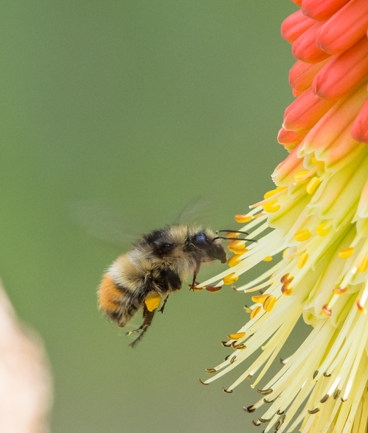
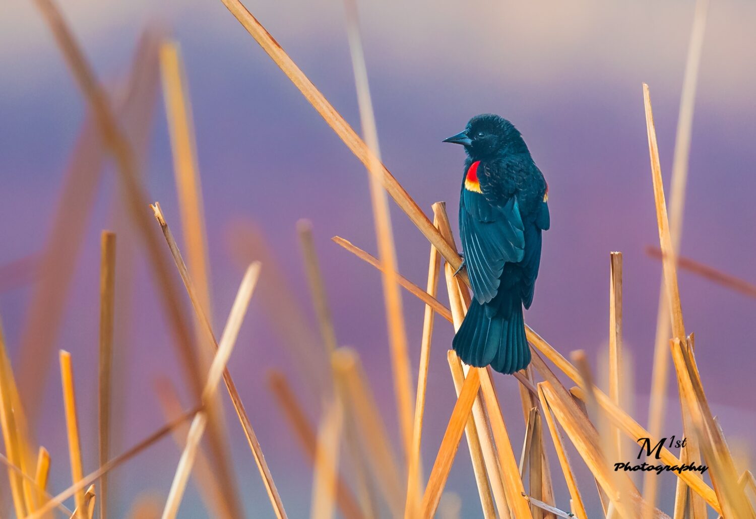
Color is a visual language that can evoke different moods and convey the essence of a scene. In wildlife photography, the natural hues of animals, landscapes, and vegetation present an incredible palette of colors. By paying attention to how light interacts with these colors, we can effectively capture the vibrancy and diversity of wildlife. We will delve into the color wheel, color harmony, and the role of complementary and analogous colors in wildlife photography. The relationship between light and color is fundamental and is based on how light interacts with objects and our perception of that interaction. As mentioned earlier, light is part of the electromagnetic spectrum, which includes a range of wavelengths and frequencies. The visible spectrum, the portion of the spectrum that our eyes can detect, is responsible for our perception of color. Different wavelengths of light within this spectrum are associated with different colors. When light interacts with an object, it can be absorbed or reflected. The colors we perceive are a result of the interaction between light and objects. An object appears a certain color because it reflects or transmits certain wavelengths of light and absorbs others. For example, an object that appears red absorbs most of the wavelengths of light except for those in the red part of the spectrum, which it reflects.
The mixing of colors can be understood through two primary models, additive and subtractive color mixing. Additive Color Mixing is a model used with light sources such as computer screens or stage lighting. In additive mixing, different colors of light are combined to create new colors. The primary colors in this model are red, green, and blue (RGB), and combining them in varying intensities can produce a wide range of colors. When all three primary colors are combined at full intensity, they create white light. Subtractive Color Mixing is a model based on the absorption of light by pigments or dyes. It is commonly used in traditional color mixing, such as mixing paints or in printing. In subtractive mixing, the primary colors are cyan, magenta, and yellow (CMY). When these colors are combined in different proportions, they absorb specific wavelengths of light, resulting in the perception of different colors. Combining all three primary colors in equal amounts results in a subtractive color mixture that appears black.
Our perception of color is a result of how our eyes and brain process the information received from light. The human eye contains specialized cells called cones that are sensitive to different wavelengths of light. These cones enable us to perceive colors and distinguish between them. The three types of cones primarily respond to red, green, and blue light, which form the basis of our color vision. Color temperature refers to the perceived “warmth” or “coolness” of light. It is measured in Kelvin (K). Light sources with a lower color temperature, such as incandescent bulbs, appear warm or yellowish. Light sources with a higher color temperature, such as daylight or fluorescent bulbs, appear cool or bluish. Color temperature influences our perception of the color of objects under that light.

In the realm of wildlife photography, understanding the color wheel, color harmony, and the role of complementary and analogous colors can significantly enhance the visual impact and storytelling potential of our images. The color wheel acts as a guide, representing the full spectrum of hues and their relationships. By strategically selecting colors that lie opposite each other on the wheel, known as complementary colors, we can create dynamic contrasts and draw attention to our wildlife subjects. Complementary colors intensify each other when placed together, resulting in striking and captivating compositions. On the other hand, analogous colors, which are adjacent to each other on the color wheel, offer a more harmonious and cohesive palette. These colors blend seamlessly, allowing us to evoke a sense of unity and tranquility in our wildlife photographs. By employing the principles of color harmony, wildlife photographers can skillfully utilize complementary and analogous colors to amplify the visual impact of their images and create captivating compositions that resonate with viewers.
The Histogram
In photography, light is the primary element that a camera captures to create an image. When light enters the camera through the lens, it interacts with the camera’s sensor or film, exposing it to different intensities of light. The sensor records the amount of light that reaches it, creating an electrical signal that represents the brightness values of each pixel. The brightness values captured by the camera sensor are used to create the tonal values in an image. These tonal values range from pure black to pure white, with various shades of gray in between. The histogram represents the distribution of these tonal values in the image. The relationship between light, the histogram, and color is interconnected in photography and relates to how light influences the tonal distribution and color representation in an image.
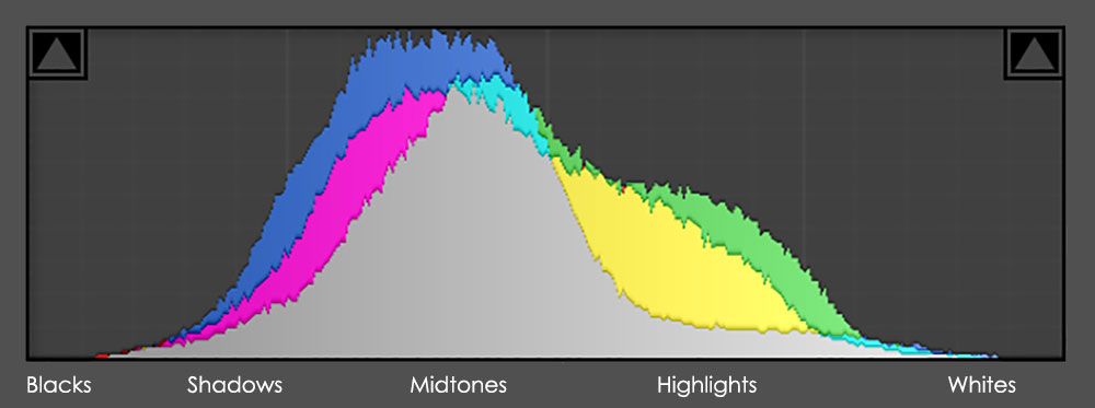
The histogram’s horizontal axis represents the pixel intensity levels, while the vertical axis represents the frequency or the number of pixels at each intensity level. Histograms are particularly useful in evaluating the exposure of an image. A well-exposed image typically has a balanced distribution of tones across the histogram, with no significant loss of detail in the shadows (left side) or highlights (right side). By analyzing the histogram, photographers can assess whether the image is underexposed (too dark), overexposed (too bright), or properly exposed. The histogram provides information about the tonal range of an image. The left side of the histogram represents the shadows and darker tones, while the right side represents the highlights and brighter tones. The middle portion of the histogram represents mid-tones. By examining the distribution of tones in the histogram, photographers can assess whether an image has a wide tonal range or if it is predominantly composed of darker or brighter tones.
Histograms help identify areas of an image where the tonal information has been lost due to overexposure or underexposure. Clipping occurs when the histogram reaches the extreme edges of the graph, indicating areas where detail has been lost in pure black or pure white. It is important to avoid significant clipping unless it is an intentional creative choice. In some advanced cameras or image processing software, histograms can be displayed for individual color channels (red, green, and blue) separately. This allows photographers to analyze the distribution of tones in each color channel and make precise adjustments to achieve accurate color balance. By interpreting the histogram, photographers can make informed decisions regarding exposure settings, ensure proper tonal distribution, and make adjustments to achieve the desired outcome in their photographs. It is a valuable tool for evaluating and fine-tuning the exposure and tonal range in digital images.
In wildlife photography, understanding the relationship between light, color, and the histogram is paramount to creating impactful and visually stunning images. By harnessing the power of light, interpreting the colors of nature, and utilizing the histogram as a guide, we can capture the true essence of wildlife. With practice and a deep appreciation for these interconnected elements, we can embark on a captivating journey to document the remarkable beauty of the natural world through our lenses.